Tip no. 2: Create a sense of order for the learners
Look at these two posters
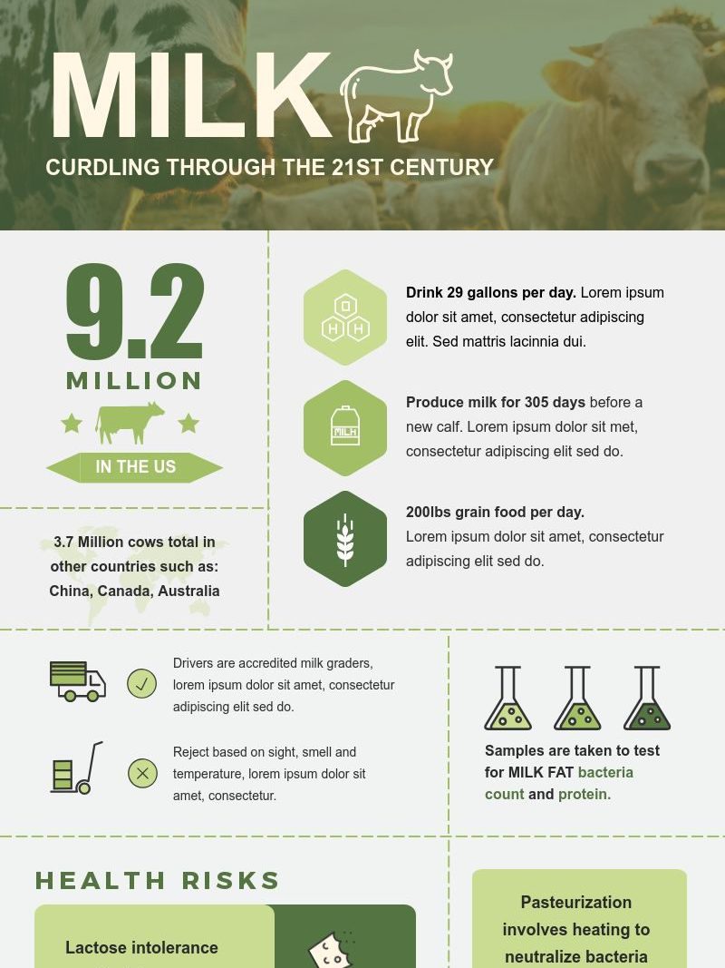

You will notice that the poster on the left has appropriate amount of white space which helps the reader to find relevant information easily and is calming to eyes. Whereas, the poster on the right has very little white space making it look very cramped.
Quickly go through all the pages in this topic again.
Did you notice any consistency in the design of the elements?
The same color theme and fonts has been followed on each page. Title of the tips is always in blue color, checklists are always in green and end note is always in orange
Go through the two posters on this page again, you will notice that Poster 1 follows a particular color theme and fonts, whereas Poster 2 does not follow any single color theme and font. (You can use this link to find your color scheme: https://community.articulate.com/articles/5-easy-ways-to-find-a-great-color-scheme)
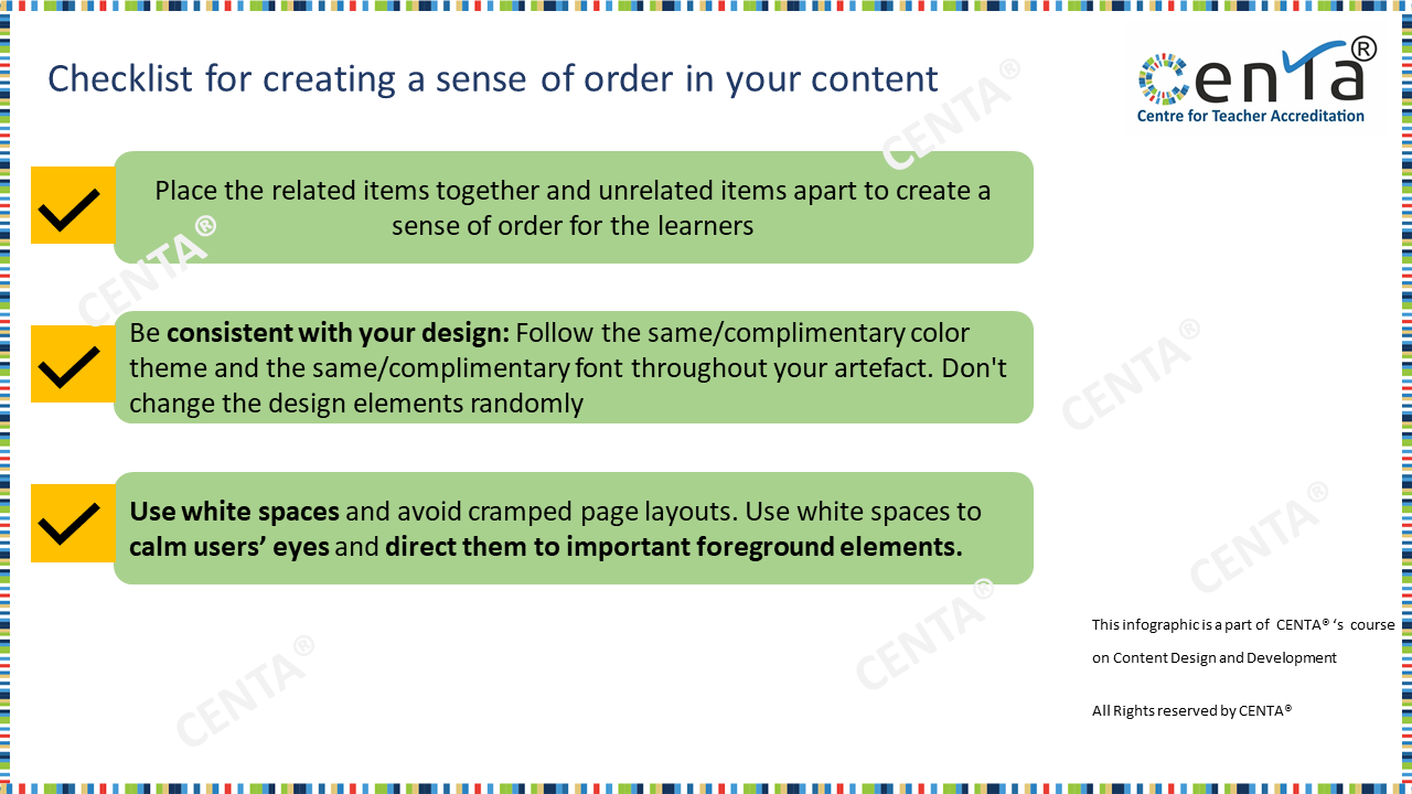
Download this checklist to create a graphical content with a sense of order for the learners
*Visit all the pages in this topic to make the most of the practical tips!*