What makes a graphic content good?
Purpose of a graphic content: Whenever you are designing a graphical content such as an infographic, poster, newsletter, worksheet etc. , focus on how to serve the audience the information they need in the most natural way possible.
Let’s look at some tips to help you do that
Tip no. 1:
The Structure: Build a structure that supports scanning/quick reading by readers
People scan through the content in brochures, newsletters, infographics and presentations and don’t always sequentially read everything in detail at the first glance. So your content can be designed in such a way that it supports scanning/quick reading
Take a quick look at this infographic (the sample template with recorded analysis given to you in the “Analyze” lesson was created during the analysis phase of creating this infographic using the ADDIE model)
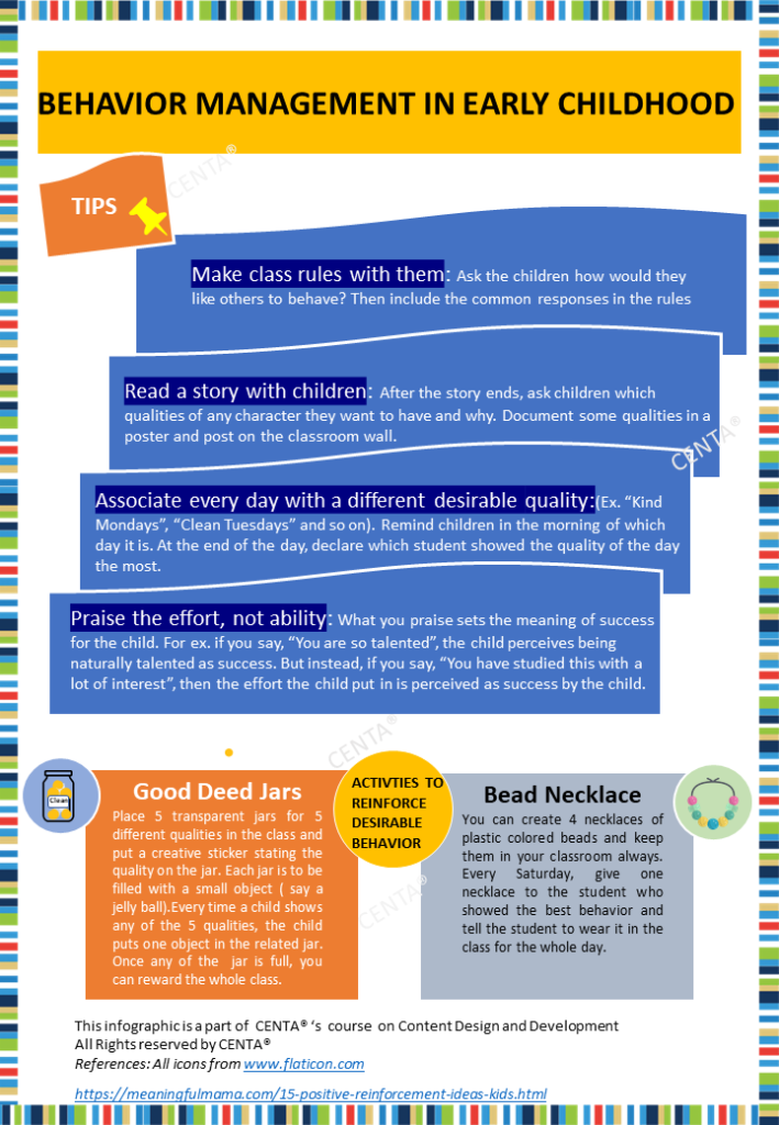
In the infographic, you will notice:
- The content has been placed in a Z-shaped pattern and the rest is white space
- The tips has been made noticeable using subheadings, bigger size and a contrast highlight color
- Rest of the details are in smaller sizes
- “Activities to enforce desirable behaviour” has been made noticeable using a contrast color and ALL caps
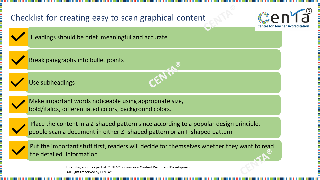
Download this checklist which states the aspects to keep in mind to make the content easy to scan and for quick reading
*Visit all the pages in this topic to make the most of the practical tips!*